
Data visualization is one of the most effective ways to communicate complex information quickly. A well-crafted chart or graph can turn raw numbers into actionable insights, highlight trends, and guide decisions.
However, visualizations can also mislead, confuse, or overwhelm if not designed carefully. Even small errors—like choosing the wrong scale, using confusing colours, or overloading a chart with information—can distort the story your data is trying to tell.
In this blog, we’ll explore five common mistakes in data visualization and provide practical tips to avoid them. By understanding these pitfalls, you’ll be able to:
- Ensure your charts are accurate and honest.
- Make complex data easy to understand.
- Avoid unintentionally misleading your audience.
- Highlight the right insights effectively.
Whether you’re presenting sales numbers, survey results, or performance metrics, these tips will help you create visualizations that truly inform and engage your audience.
1. Using the Wrong Chart Type
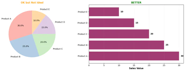
One of the most fundamental mistakes is choosing a visualization that doesn’t match your data or message. Pie charts for comparing more than five categories, 3D charts that distort perspective, or line charts for non-continuous data can all confuse rather than clarify.
How to avoid it: Match your chart to your purpose. Use bar charts for comparisons, line charts for trends over time, scatter plots for correlations, and heat maps for patterns in large datasets. Ask yourself: “What’s the key message?” and choose accordingly.
Example: If you want to show how market share has changed over five years across three competitors, a stacked area chart or grouped line chart works better than a series of pie charts.

2. Manipulating the Y-Axis Scale
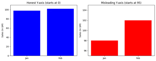
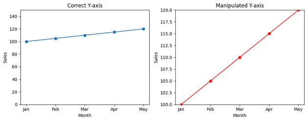
Truncating the y-axis or using inconsistent scales can exaggerate small differences or downplay significant changes. This technique is often used to make data appear more dramatic than it actually is, whether intentionally or accidentally.
How to avoid it: Start your y-axis at zero for bar charts and be transparent about any scale adjustments. If you must truncate for readability, use a break symbol and clearly label your axes. Always ask whether your visualization represents the data proportionally.
Example: A chart showing sales growth from $98M to $102M with a y-axis starting at $95M makes a 4% increase look dramatic. Starting at zero provides honest context.
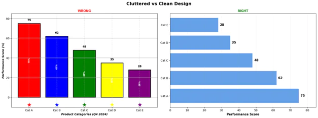
3. Overloading with Too Much Information
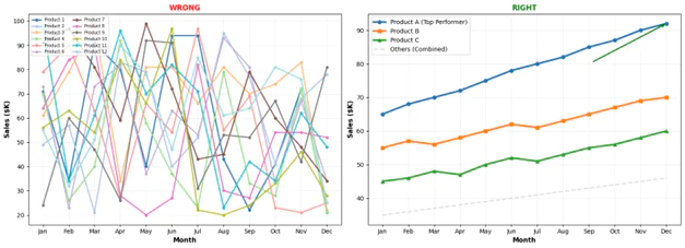
Cramming too many data series, colours, labels, or decorative elements into a single visualization creates cognitive overload. When viewers need a manual to decode your chart, you’ve defeated the purpose of visualization.
How to avoid it: Follow the principle of simplicity. Limit colours to 5-7 maximum, remove unnecessary gridlines, eliminate decorative elements, and consider breaking complex data into multiple focused charts. Use direct labelling instead of legends when possible.
Example: Instead of showing 15 product lines on one chart, create separate visualizations for your top 5 products and group the rest as “Other” or create a dashboard with filters.
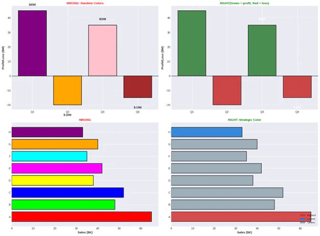
4. Poor Colour Choices
Using colours randomly, ignoring colour-blind accessibility, or choosing colours that don’t align with cultural expectations can make your visualization ineffective or misleading. Red and green combinations are particularly problematic for the 8% of men with colour vision deficiency.
How to avoid it: Use colourblind-friendly palettes like Colour Brewer or Viridis. Maintain consistency (red for negative, green for positive). Use colour purposefully to highlight important data, not decorate. Test your visualizations with colourblind simulation tools.
Example: A heat map using only red-green gradients excludes colourblind viewers. Using blue-orange or blue-yellow gradients ensures everyone can interpret your data.
5. Missing or Misleading Context
Data without context is meaningless. Failing to include units, baselines, sample sizes, time periods, or comparative benchmarks leaves your audience guessing about the significance of what they’re seeing.
How to avoid it: Always include clear titles, axis labels with units, data sources, and timestamps. Add reference lines for benchmarks or goals. Include sample sizes for survey data. Provide brief explanatory text when needed.
Example: A chart showing “Customer Satisfaction: 7.2” means nothing without knowing the scale (1-10?), the comparison point (up from 6.8?), the sample size (10 or 10,000 customers?), or the industry benchmark.

The Data Visualization “Check for Success”
Chart Selection: Ensure the chart type matches your message (e.g., bar charts for comparisons, line charts for trends, and scatter plots for correlations).
Scale Integrity: Start your y-axis at zero for bar charts to ensure data is represented proportionally and honestly.
Simplicity & Focus: Limit your palette to 5–7 colors and remove unnecessary elements like “chart junk” or decorative gridlines to prevent cognitive overload.
Accessibility: Use colorblind-friendly palettes (like blue-orange gradients) and maintain consistent color meanings (e.g., red for negative, green for positive).
Full Context: Always include clear titles, axis labels with units, data sources, and benchmarks to give the numbers meaning.
Summary
Mastering data visualization is about more than just making numbers look pretty; it’s about becoming a truthful and effective storyteller in a world overflowing with information.
By choosing the right charts, maintaining honest scales, and prioritizing clarity over clutter, you transform raw data into a powerful tool for discovery rather than a source of confusion.
Remember, the most impactful visualizations are those that respect the audience’s time and intelligence by providing clear context and accessible design.
Apply these principles to your next project, and watch your data come to life, sparking better conversations and more informed decisions.
Written by
Roshan Nikam
Data Science Intern
Stat Modeller